James H Data projects

Opens the live site in a new tab

Websites for small businesses, designed and built by James H

I’m James, a designer and developer in Montgomery County, Maryland. Five projects I designed and built. Pick one.

Pick a kind of business to see the work
Concept The Turnbridge Fund, a community foundation. Design notes
Concept Small Hours Creamery, a craft ice cream shop. Design notes
Concept Brightdeep Coffee, a coffee roaster. Design notes
Concept Wrenfield Landscapes, a landscaping crew. Design notes
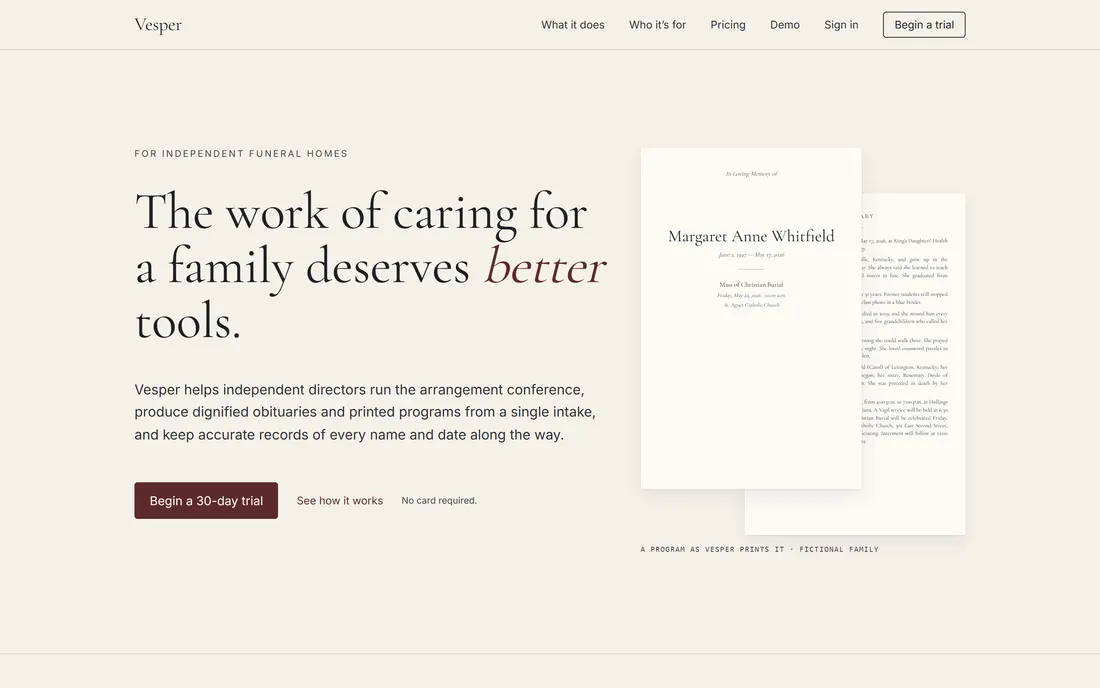
Product Vesper, software for independent funeral homes. Design notes

Five sites and the decisions behind them.

Four are concept sites for made-up businesses and organizations. Each one works through a common problem: an annual report that nobody reads, a long menu, a product that is hard to choose, a service sold on results. The fifth, Vesper, is a software product for funeral homes. All five are live. The numbers on each screenshot match the notes beside it.

Concept 01 · Community foundation

The Turnbridge Fund

The problem: an annual report that nobody reads.

  1. The chart is the picture

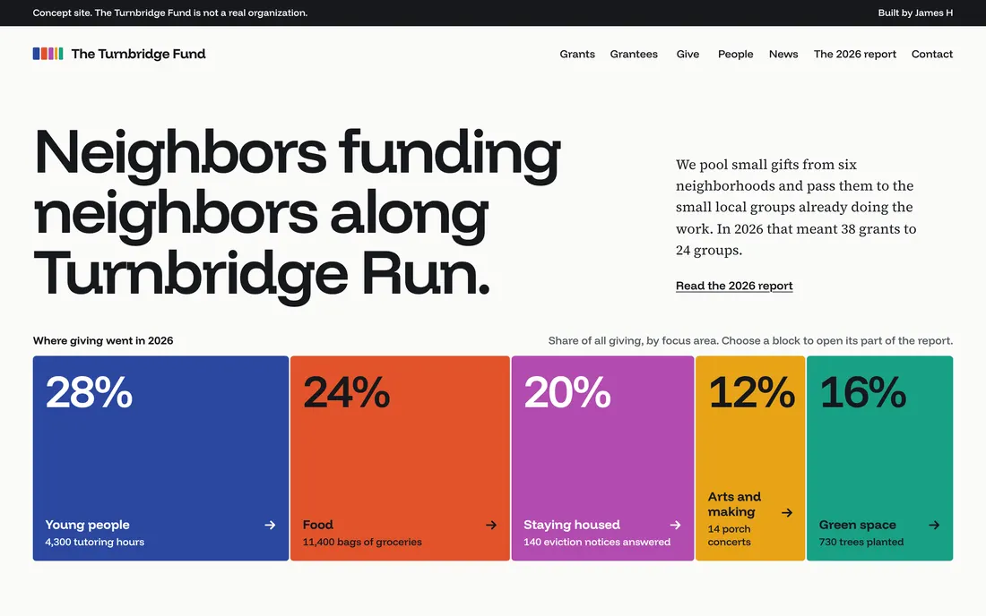
    The year’s giving is drawn to scale as five blocks, one for each focus area. It sits where a stock photo usually goes, and each block opens that part of the report.

  2. One color for each focus area

    Blue is young people, orange is food, and so on, on every page. The five were tested so that color-blind readers can tell them apart.

  3. Counted in results

    The report gives no sums of money. It shows shares and counts: 38 grants, 24 groups, 11,400 bags of groceries. Tap a block to see who did the work.

Type specimen: Funnel Display for headings, Source Serif 4 for text.
  • Paper #FBFBF8
  • Ink #16181D
  • Young people #2B47A0
  • Food #E2532A
  • Green space #18A085
Visit turnbridge.jamesh.studio (opens in a new tab)

Concept 02 · Craft ice cream shop

Small Hours Creamery

The problem: a thirty-flavor menu on a phone screen.

  1. Quiet page, one photo

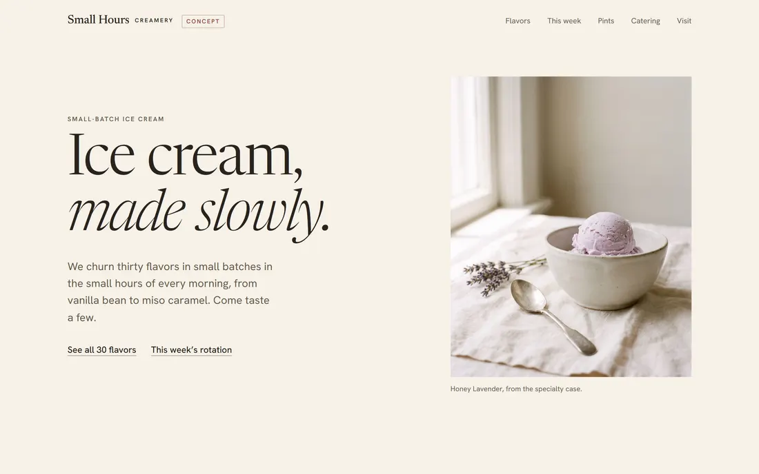
    Cream background, one serif, almost no color. The scoop is the only photo on the first screen, so the eye goes there first.

  2. One typeface does the branding

    Newsreader at a light weight, set large, with the second line in italic. There is no logo mark. The headline carries the tone.

  3. Filters before the list

    Thirty flavors is too many to scan on a phone. Dairy-free and No nuts sit above the menu and cut it down in one tap.

Type specimen: Newsreader for headings, Hanken Grotesk for text.
  • Paper #F6F1E8
  • Panel #EDE5D6
  • Ink #29231D
  • Sage #55633E
  • Rose #8F4537
Visit smallhours.jamesh.studio (opens in a new tab)

Concept 03 · Coffee roaster

Brightdeep Coffee

The problem: ten coffees that sound alike to most buyers.

  1. The chart is the navigation

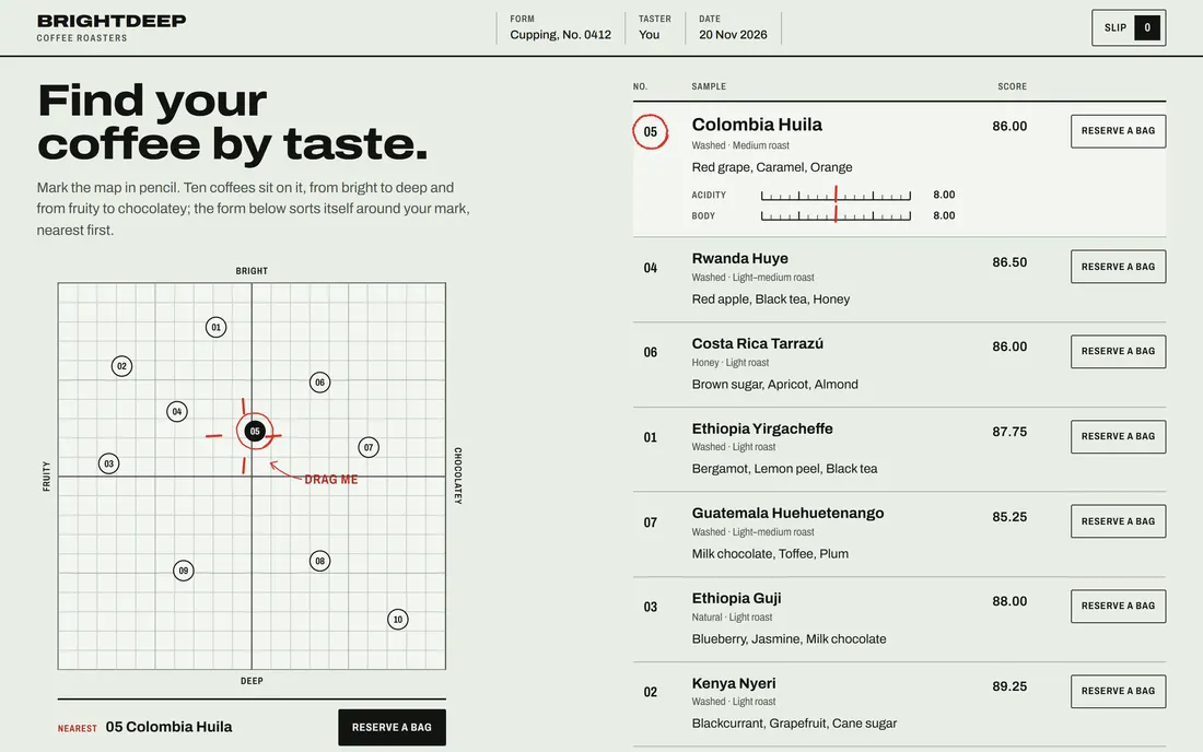
    Ten coffees are plotted by taste, fruity to chocolatey and bright to deep. Dragging the mark re-sorts the list by distance, so people choose by taste.

  2. Borrowed from a cupping form

    Ruled lines, numbered samples and a score column. It borrows a format roasters already use to grade coffee.

  3. Red is the pencil

    Everything printed is black on pale sage. Everything marked by hand, such as the spot on the chart and the scores, is pencil red.

Type specimen: Archivo, widened for headings and regular for text.
  • Form stock #E9EEE6
  • Highlight #F3F6F1
  • Print #121412
  • Pencil red #D7322B
  • Pen blue #2B5BD7
Visit brightdeep.jamesh.studio (opens in a new tab)

Concept 04 · Landscaping crew

Wrenfield Landscapes

The problem: a service people judge only by the result.

  1. One yard, before and after

    The slider shows the same backyard in both states. It puts the finished result next to the starting point.

  2. Two actions that never scroll away

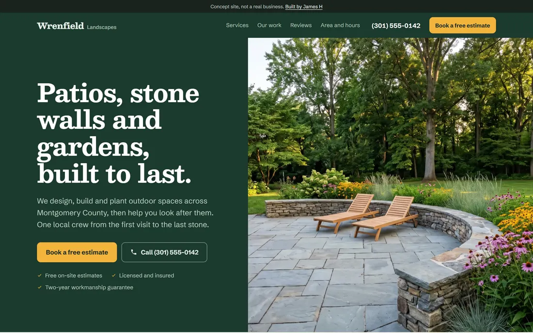
    The estimate button and the phone number stay in the header on a computer and in a bar at the bottom of a phone.

  3. One warm color

    Dark green and off-white carry the page. Marigold is used for the main buttons and a few small marks, so it reads as the next step.

Type specimen: Besley for headings, Schibsted Grotesk for text.
  • Forest #1B3A2D
  • Forest light #24503D
  • Ground #F0F2EC
  • Ink #18231D
  • Marigold #F2B43C
Visit wrenfield.jamesh.studio (opens in a new tab)

Product 05 · Software for independent funeral homes

Vesper

The problem: an obituary cannot contain a single wrong fact.

  1. The draft and its source, side by side

    The obituary is on the left. Click a sentence and the family’s own words that it came from are highlighted on the right.

  2. A flag explains itself

    A sentence the family’s words don’t support is marked, with a plain note on what differs. The director decides what to do with it.

  3. Quiet on purpose

    Parchment, a book serif and one dark red. No bright color and no animation. The home page leads with the printed program.

Type specimen: Cormorant Garamond for headings, Inter for text.
  • Parchment #F5F1EA
  • Card #FCFAF5
  • Rule #D6CFC0
  • Ink #1C1F22
  • Oxblood #5C2A2A
Visit vesper.jamesh.studio (opens in a new tab)

About

I’m James, a designer and developer in Montgomery County, Maryland. I design these sites and build them myself, so the layout, the type and the code come from the same person.

This page covers the design side of my work. I also build data-heavy sites: live transit maps, public-records trackers and guides that refresh from county and market data every day. Those are at jamesh.studio.

Email: [email protected]

Outline map of Montgomery County, Maryland, marking Damascus, Germantown, Gaithersburg, Poolesville, Olney, Rockville, Bethesda and Silver Spring.
Montgomery County, Maryland